Hello, and welcome to my new site. I’ve been a web developer and designer for some five years now, both as a freelancer as well as having worked with agencies. If you’d like to read a bit more about me then you can do so here, and do please let me know if you encounter any bugs or want to give me any feedback.
With this first post I want to talk about my workflow whilst creating this site, and some of the processes and tools I used. My initial objective was simply to create a site which conveys my skills whilst being nice and easy to use across a range of devices, so I decided that a simple design and content structure — with an emphasis on responsive design and performance — would help me meet this objective.
Begin, Don’t End, With Content and Structure
Sometimes designers dive into the aesthetics of websites, without considering the content or required page structure until towards the end of the project — often with Lorem Ipsum text in place of final copy, and menus listing “page 1”, “page 2”, “page 3” and so on.
Where possible, web projects should begin — not end — with their content and structure, simply because a website’s content is overwhelmingly its most important component. By organising the page structure early you can get a better sense of whether the information is organised in a way which is easy to navigate, while working with prior knowledge of the required content and page structure means costly mistakes can be avoided at the design stage. Aesthetics and layout should compliment the content, rather than merely enclosing it.
In this case, I began by fleshing out a site structure diagram on paper which broadly stipulated which content and elements would go where, and how many pages would be required. I then quickly wrote some draft copy for each page — even if you’ve only got rough notes to work with, it’s still better than nothing!
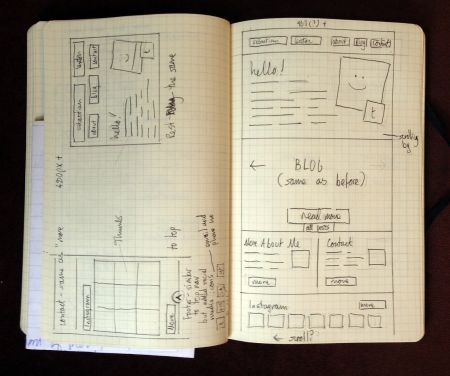 Following this I produced wireframes for each proposed page. This helped me visualise how the result would look in terms of layout, and is also pretty essential for designing responsively (the process of creating websites which are easy to read, regardless of whether you’re using a phone, desktop computer or whatever). This gave me an opportunity to refine my layout, menus and content structure before even beginning any “serious”, time-consuming work on a computer.
Development Commences
At this point I had a fairly comprehensive plan of where I was going, so I began developing. My next stage was to produce what I refer to as a functional wireframe: a live, working version of the website which is accurate to my plan. This version of the site is reasonably complete with regard to layout and JavaScript interactions (not that I’ve used much JavaScript for this particular project) but doesn’t include any aesthetic design work with regard to colours, textures or typography.
These don’t take too long to develop, and give a good indication of how the site will work in situ. The first step of this was to take a fresh WordPress install and simply add my draft content and page structure, before working on the markup and CSS required to build the page layout. The result is a prototype version of the website which conveys fairly accurately how it will work to the end user, how easy it is to navigate and how well it communicates its objectives. Again, potential problems which may not have been apparent at the planning stage can often be nipped in the bud, without wasting time polishing and completing elements which ultimately prove to not work well.
With my prototype complete, only now do I fire up Photoshop. Since I’ve already wireframed the pages on paper and put together the basic layout in HTML and CSS using an IDE and my web browser, there’s simply no point in producing traditional static comps (and besides which, some argue that responsive design has mostly rendered the traditional Photoshop comp obsolete). These days I use Photoshop more to explore ideas, create textures, experiment with colour schemes and generally define an aesthetic which complements each project, similar to a mood board or style tile. Given that one of my aims with this project was fast loading and performance, I kept visual embellishments to a minimum.
By this stage I was coming fairly close to a finished product. I continued to polish and refine, squashed a bug or two, tested across a variety of browsers and devices and reworked my original draft copy. And finally, after minifying my JS and CSS and polishing a little more, I deployed the finished product to my live web server.
Technologies Used
Find below a list of tools, frameworks and technologies used to develop this site. If you’ve any experience with developing or designing websites then you will probably be familiar with most of these.
- A Mac: my platform of choice for development, as some of the tools I use aren’t available on PC or Linux. That said, the platform (and indeed, software) you use is irrelevant if the end results are no good!
- Coda 2: I’ve been using Panic’s Coda IDEs for some time now. I’ve tried a few alternatives, but I tend to find myself drifting back to Coda simply because I’m used to it.
- Adobe Photoshop: an image editor, which probably needs no introduction. I do also use Adobe Fireworks sometimes, but didn’t on this project.
- XAMPP: all of my sites are developed locally on my own machine, which speeds up development compared to having to upload and edit files on a remote web server. XAMPP enables a local LAMP (Linux, Apache, MySQL, PHP) server stack to be setup on a computer with a minimum of fuss.
- Browserstack: allows testing of websites across a variety of browsers, platforms and devices, within a web browser.
- WordPress: no longer “just” a blogging platform, WordPress has become a customisable and extensible CMS which is good for building websites quickly and easily. I also used a few plugins to add required functionality.
- Bones: a WordPress foundation theme, upon which I built my own custom theme for this site. Based around the popular HTML5 Boilerplate.
- jQuery: the world’s most popular JavaScript library. I used a custom build available from here.
- Modernizr: a JavaScript library used for feature sniffing. This enables fallbacks to be provided for older browsers (particularly, older versions of Internet Explorer) which lack key features provided by modern browsers.
- SASS: a CSS preprocessor. this allows the use of variables, mixins and other features within regular CSS. An essential part of my workflow, especially when using media queries to build responsive layouts.
- ImageOptim: a tool which losslessly compresses web images further than Photoshop’s “save for web” feature is able to. Useful for shaving a few kilobytes from a page’s weight.
- IcoMoon: A custom icon font generator, which I used for my social media icons.
- Git: like most people these days I use Git for version control, although I have used SVN in the past. I use Bitbucket to host the Git repository for this site, as unlike GitHub they provide free private repositories.
- Linode: my sites are hosted in London on a Linode VPS. If you’re looking for good quality Linux-based VPS hosting then I would thoroughly recommend them — please use my referral code!
- Pens and paper: hopefully, this needs no introduction.
Anyway, I hope you enjoyed this post. I’m looking forwards to writing more, so please follow me on Twitter or subscribe via RSS if you’d like to be kept informed of future posts.